A different look yields a different look: Introducing our new brand.
John Webre
March 1, 2016
Al Dreyfuss and Len Blackford never relied on convention. They did things their own way. The firm was built on this premise and it continues to inform the direction of Dreyfuss + Blackford today. We constantly reinvent ourselves, and now, our new brand reflects the latest in our evolution.
Legacy of Two. Future of Many.
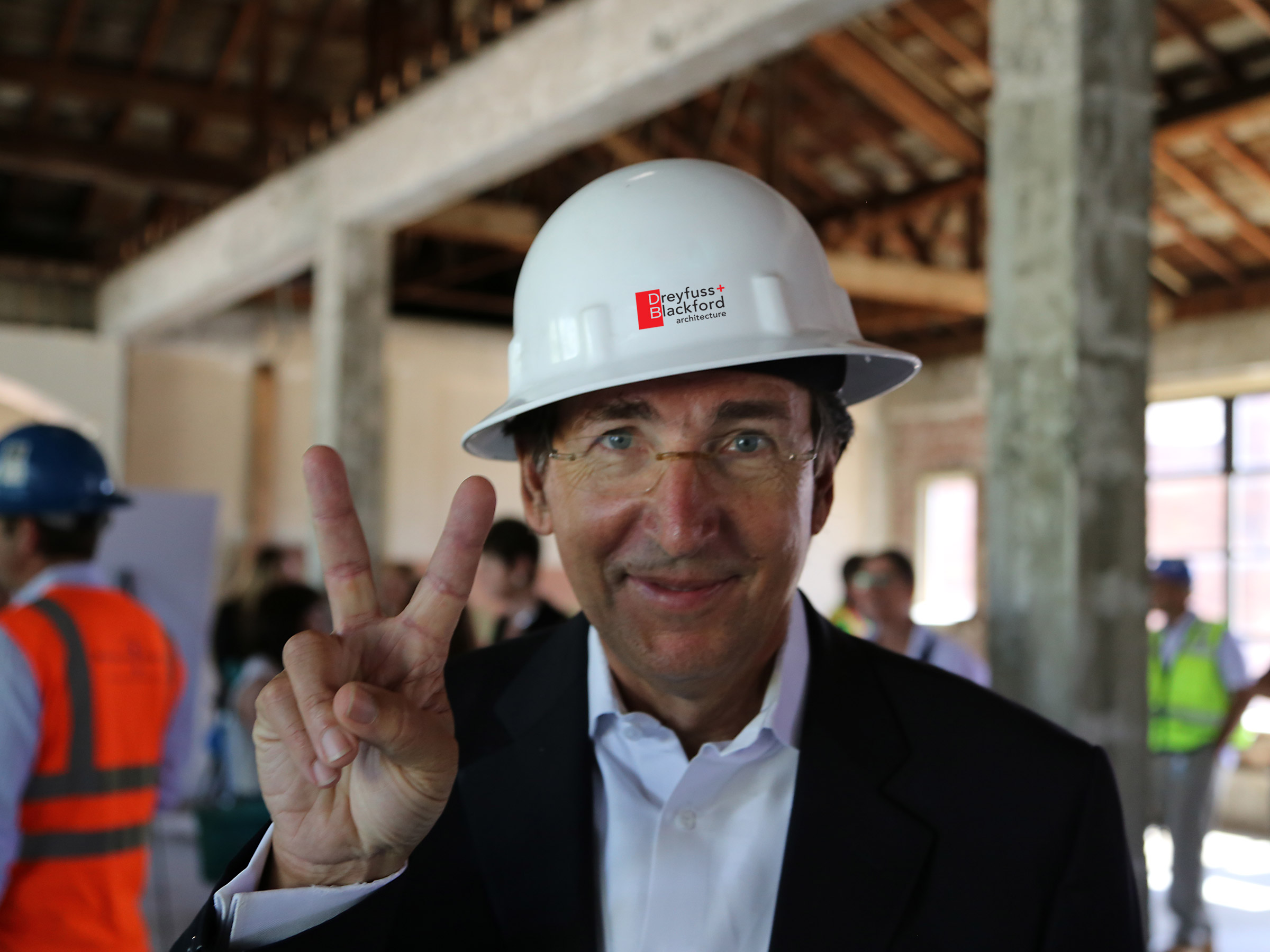
It has been 20 years since we adopted the red box and clean lines that became a hallmark of our identity. We are a different firm than when we last branded ourselves, evolving from landmark Sacramento projects to a Bay Area office, temporary architecture pavilions and even the occasional dog running around the office. We wanted our brand to reflect the changes over the past two decades.
Always forward thinking, the firm has become even more so in the past few years, embracing technology and harnessing the energy and creativity of millennials. We are hungry for innovation. We are embracing new talent. We are expanding our reach. We are reinvigorated! The stage was set.
We explored our brand with an inclusive perspective. Decisions didn’t come from the top of the mountain but rather grew up from the ground. Who are we now? Who do we want to be? What makes us different? Together, we set about defining who we are as a firm; valuable insights to consider from new team members and long-time staff alike. These are just a few of the comments we received about the “why” of Dreyfuss + Blackford:
“There are no limits; no ceiling on what we can do.” Stephanie Swain
“We provide opportunities for growth, both professionally and personally.” Dave Vagg
“We have strong commitment to being a great team.” Courtney Johnson
“The diversity and quality of our work drives us.” Jennifer Costa
“We have authentic and deep relationships with our clients.” Courtney McLeod Golden
“We feel supported at every level. Leadership encourages us to pursue our passions and allied interests and share them with our colleagues.” Christopher Holt
“We are embedded in the creative community. Our passion goes well beyond the office.” Jeffrey Yip
“We feel part of something. It’s a family here.” Garrett Sweeden
We also took the opportunity to get really contemplative; to collectively look at every permutation of our marks of the past. Closely examining typefaces, different applications and the colors of our mark (aka the “red box”) was literally an exercise in seeing things differently. Our “red box” was reinvented as a “red golden mean” and no longer was a variation on pantone warm gray #7 the right choice.
Discovering there is real freedom in a tasteful, contemporary palette was just one of many revelations. So many varieties of type (let alone the back stories on their creators). And design for print vs. digital? That was an education in itself. We are always learning here.
Many Voices. One Vision.
By allowing ourselves to be deeply curious, our journey to explore the “why” propelled us forward. From that “why,” we successfully collaborated to achieve the distilled vision. Our new brand is a tribute to the past with a shout out to the future. As we have changed our brand, so has this effort inspired us to continue seeking change; reaching deep to establish new pathways to design which are innately different…just like us.
Subscribe to learn about our latest projects, news + updates.