The Creative Challenge of Branding Creatives
Will Smith
July 28, 2016
I joined the Dreyfuss + Blackford team in late June 2015. My new role included developing an updated brand for the company. Though I had been a fan of D+B’s architecture for years, my process began with research; lots of research. Trying to understand the origins and evolution of a 65+ year-old, iconic architectural practice took weeks of thumbing through stacks of binders and photos, many in-depth conversations and a ton of general poking around. There were many sources of information, both internal and external, and just as many points of view. After all the data gathering, I developed a case study from my historic findings, market research and the environment around me.
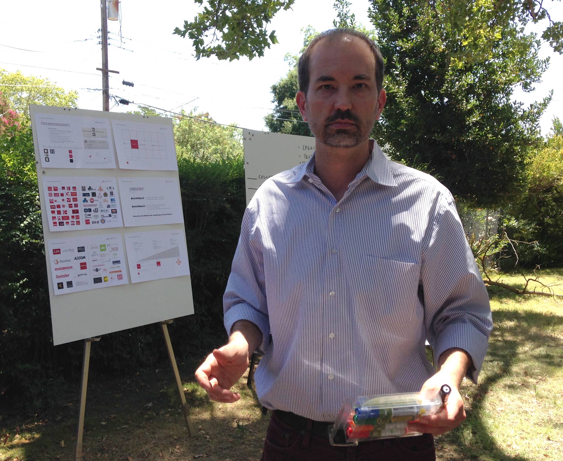
Jason Silva facilitating marker distribution at an early branding workshop // photo by Me.
It quickly became apparent this process could and should be a collaborative effort. With an office full of creative designers on hand, how could it not be? Using the case study as a guide, we worked together to develop a brand that would honor the D+B legacy and at the same time, represent an evolving group of talented communicators, designers and planners. We participated in lunchtime brainstorming workshops using sticky notes and colored dots. We had meetings, both big and small, to flush out a brand we could all believe in. It was an involved process.
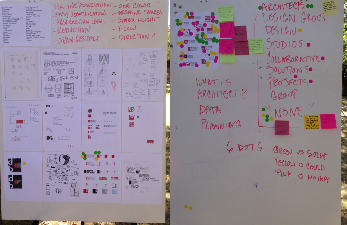
Sticky notes and colored dots aided in the collaborative effort // photos by Me.
We looked at every angle of our identity, from our naming convention to the form and function of our mark. Functional considerations ranged from digital and animation, to how our brand would look on banner on the side of a project. My role fluctuated between designer and facilitator/synthesizer, drawing out and reinterpreting the rush of ideas and opinions from the office at large. Great care was taken to incorporate our San Francisco identity since this would serve as an introduction of our existing office to the Bay Area.
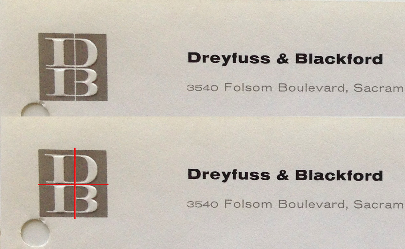
The original “+” from our 1963 logo was so subtle, it was easily missed // photo by Me.
Through collaboration, we accomplished what we set out to do. Our red square became a dynamic red golden mean and our ampersand changed to the plus that was so subtly integrated into the 1963 logotype. Representing the “and” as a “+” had a more positive, inclusive meaning as well. Likewise, moving from who we are – “architects” – to what we do – “architecture”- was a broader, more fitting description of our work. Our type treatment took on a cleaner, more modern feel reminiscent of the original type from 1950. Finally, a logotype system was developed that would facilitate a host of uses from social media to site signage.
In the end, we developed a more accurate representation not only of who the firm is now, but who we hope to be 10 years from now. Most importantly, though, we found a way to represent ourselves that we didn’t just like…we owned: We are Dreyfuss + Blackford Architecture.